Lumière Design System
Lumière Design System

Lumière Design System, was created to unify the visual and functional design of Metro-graph’s website by improving collaboration between designers and developers.
Project Overview
The Client
Metrograph, is an independent theater in the Lower East Side, which specializes in rare archival screenings and special premieres.
The Team
Eleanor Cunningham-Rothwell
Chieh Lei
Emily Gu
Eloisa Rodriguez
Responsibilities
Deconstruct current website
Identify design inconsistencies
Develop components & design system
Document design system for developers
Timeline
September - December 2024
14 weeks
The Workflow
Problem
Metro-graph currently lacks a centralized design library, resulting in an inconsistent website and therefore user experience.
Context
By enhancing this website services, through visual design and user experience, Metrograph could preserve the vintage and in-cinema experience.
Action
Complete a full design audit to understand the full breadth of these inconsistencies and propose design improvements.
The Process
We’ve conducted an audit of the website in order to identify design inconsistencies. This lead us to prioritize items to be addressed with level of effort and urgency.
Compile
Created an inventory of existing styles in the current website (landing page and unique pages).
We proceeded to compare findings to prioritize design inconsistencies.
Define
Analyzed the inventory to enhance and standardize components based on best UX/UI standards and aligned brand key values.
Create
Based on Atomic Design Approach we proceed to determine foundations and design components.
Document
For each component and style, we are listing guidelines on how they should be used.
Audit Findings & Recommendations

Color Palette
The website’s background isn’t ideal; it tries for a vintage look, but the yellowish color lacks contrast. Using red for accents and hover states feels risky. Is recommended other color shades for interactions, as it gives a more positive impression.
Recommendation
Defying color tokens can help to address this design inconsistencies. Brainstorm ”Art Deco” palettes that can align with the website’s current branding while being accessible.
Typography
The usage of “All Caps” and “Camel Case” formatting between headers and sub-headers across the website isn’t consistent.
The website has +3 different font types which can be misleading and overwhelming for users with cognitive or visual impairments.
The logotype of the website is a modified font (this is just an observation.)
Limit the text formatting across the website, not more than 3 fonts styles between headers, sub headers and content.

Recommendation
Call to Actions (Buttons)
Buttons don’t have consistent states between default, hover or selected. (Except the Gift Membership one that does have hover) which is red color, this can mislead users.
Height and width isn’t consistent between primary, secondary and tertiary when it comes to text behavior and body.
Recomendation
Define color tokens in order to address this design inconsistencies.
Cards
Across the website, there are multiple cards (with and without CTAs) including large, medium and small sizing. It was appreciated that the stroke and roundness of the cards aren’t consistent between subpages while some of them have it and some of them don't. Also the height and width don’t co-relate to each other.
In the merchandise section the background of the cards are different colors (while the colors are still a good accent) they don’t seem to belong with the rest of the cards in the website.
Recomendation
Assess all the cards across the experience and create a responsive master that could adapt across different contents. Also define the style of border, roundness and CTAs.
Create
As framework, we used atomic design to create consistent, modular, and scalable components. This method, developed by Brad Frost, breaks down an interface into small, reusable parts called atoms.
These atoms can be combined to form bigger components and pages. This way, our designs can be easily updated and maintained over time.
Atoms
Molecules
Organisms
Templates
Pages
Defying Values
To create our design system, we needed to establish principles that match Metro Graph's vision and mission.
After getting to know the brand's identity and style, we defined three core values:
Efficiency
Our goal is to save designers and developers time and resources. We want support our teams in creating efficient and beautiful design that best reflects Metrograph's unique aesthetic.
Clarity
We understand the importance of clarity and consistency in the design and development process. Our system provides detailed labeling, descriptions, and examples to help teams use our UI Kit with ease and confidence.
Creativity
Metrograph is a creative space! Which is why we designed our system with creativity and flexibility in mind. Lumiére is happy to promote creativity in the design process.
Atoms
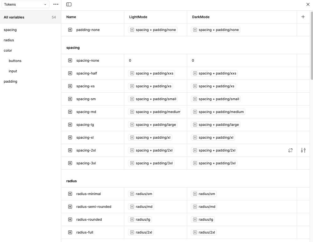
We collected all library issues from our platforms and set up our design basics: Typography, Colors (Tokens), and Iconography. We created uniform text styles for Headers, Subheadings, Body, Links, and Tabs using three fonts: Inter (Sans Serif) and Lora (Serif).
We designed a new color scheme with updated vintage colors, ensuring each color works well on light and dark backgrounds by using the WebAIM color contrast checker to meet WCAG guidelines. We also used Google Material Icons for a modern flat and curved design.


Molecules & Organisms
After setting up our foundations, we proceeded to create responsive components with auto-layout and tokens to keep consistency in spacings and paddings.


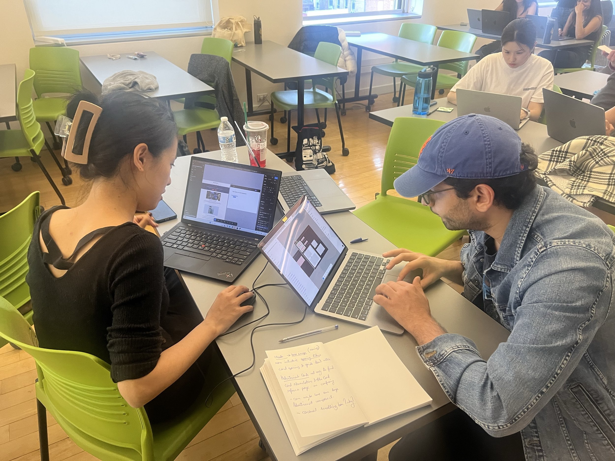
Testing the library
We proceed to test our library structure with two (2) different designers. We asked them to recreate the website’s landing page with the assets panel by typing the name of the components they believed was needed.
It was noted that since we are proposing to re-design Metro-graph’s experience, it was difficult for the testers re-create this page. Therefore, decided to include in the library a reference of the pages usage as “Homepage Example”.
Another issue found was that the cards naming conventions was not as intuitive and proceed to change them as sizing and banner for hero image.

The Before & After
Example of Metrograph’s Landing Page Before & After (Mid-D
Document
Comprehensive guidelines for using components, typography, and colors
Naming conventions and variants
Code snippets and implementation instructions for developers.
Versioning and change logs to track updates.
Dedicated section for Accessibility and Governance policies.


Lessons Learned
The project’s success depends on treating the design system as a living product, requiring continuous feedback and improvement.
Challenges of maintaining consistency without stifling creativity.
The need for ongoing maintenance and iteration.
The importance of stakeholder buy-in.
What made us succeed?
Strong leadership and clear vision.
Cross-functional collaboration and open communication.
Prioritization of accessibility and scalability.
Commitment to ongoing iteration and improvement.
“The design system became more than a toolkit—it was a catalyst for cultural change, promoting collaboration and efficiency across teams.”